
Have you ever visited a company’s website for the first time and immediately bounced off? There are many reasons you might have left. Maybe the message didn’t resonate. Maybe the message would have resonated, but you didn’t see it. Maybe you tried to navigate to another page but the navigation link wasn’t working or the load time was too long.
Now, imagine a perfect lead coming to your website, but they didn’t grasp the value of your product or service and how it could improve their lives or solve their problems. Ouch. That hurts right?
Even Wyzowl tells us that "The average human attention span has declined from 12 seconds to 8 seconds. This is much shorter than the attention span of a goldfish (at 9 seconds)". Amazing right?
This is why design plays a critical role in communicating your business value quickly, especially in today's digital marketplace.
You have to tell a web visitor who you are, what you can offer, and ultimately, it can be the deciding factor of a buyer choosing your offering... or someone else's. If your design doesn’t highlight that information quickly, your company can be completely overlooked.
Always Define Your Purpose
Quite frankly, pretty visual design is not enough if you don’t understand your customer.
When potential buyers recognize that you empathize with their struggles it becomes easy for them to let their guard down and trust your company. You can probably remember visiting a few websites and saying to yourself, “Man, this company really understands my pains.” The fact that they understood the world you live in helps you believe they're an expert and can solve your problems. It sets up a strong foundation.
These first impressions are critical; from your website to your people, to your products, and services. Ultimately, creating experiences that resonate with your personas is critical for success.
Remember, every piece of content is different.
In your website design, your Key Performance Indicators (KPIs) will be much different than your Ad on Facebook or LinkedIn. But each is an important role in the overall success of your business - it will either hinder or engage a user from learning more about your product, service, or content. That’s why at LAIRE we help our clients establish their marketing strategy before starting the execution of social media posting and/or website design and development.
Ensure that you’re asking yourself those key questions so that you start off with a good base for your initiative. Let's get started!
1. Visual Hierarchy Sets the Stage for Communication
Visual hierarchy “is the principle of arranging elements to show their order of importance.” In other words, it’s a set of design principles that guide the order of what we see and when we see it.
How does it play a role in your page or content? In any design, you should always be thinking about which path you want your user to take. It's less about slapping colors onto a page or adding a filter to an image, and more about organizing information in a way that’s usable and logical to your viewer. In fact, if you don’t position your content in a logical way, it can make your most important calls-to-action seem meaningless, irrelevant, or unseen.
A good example is from SquareSpace. In the image below, you can see the path the user takes as they scan the page. Notice how the user scans the page from left to right, top to bottom.
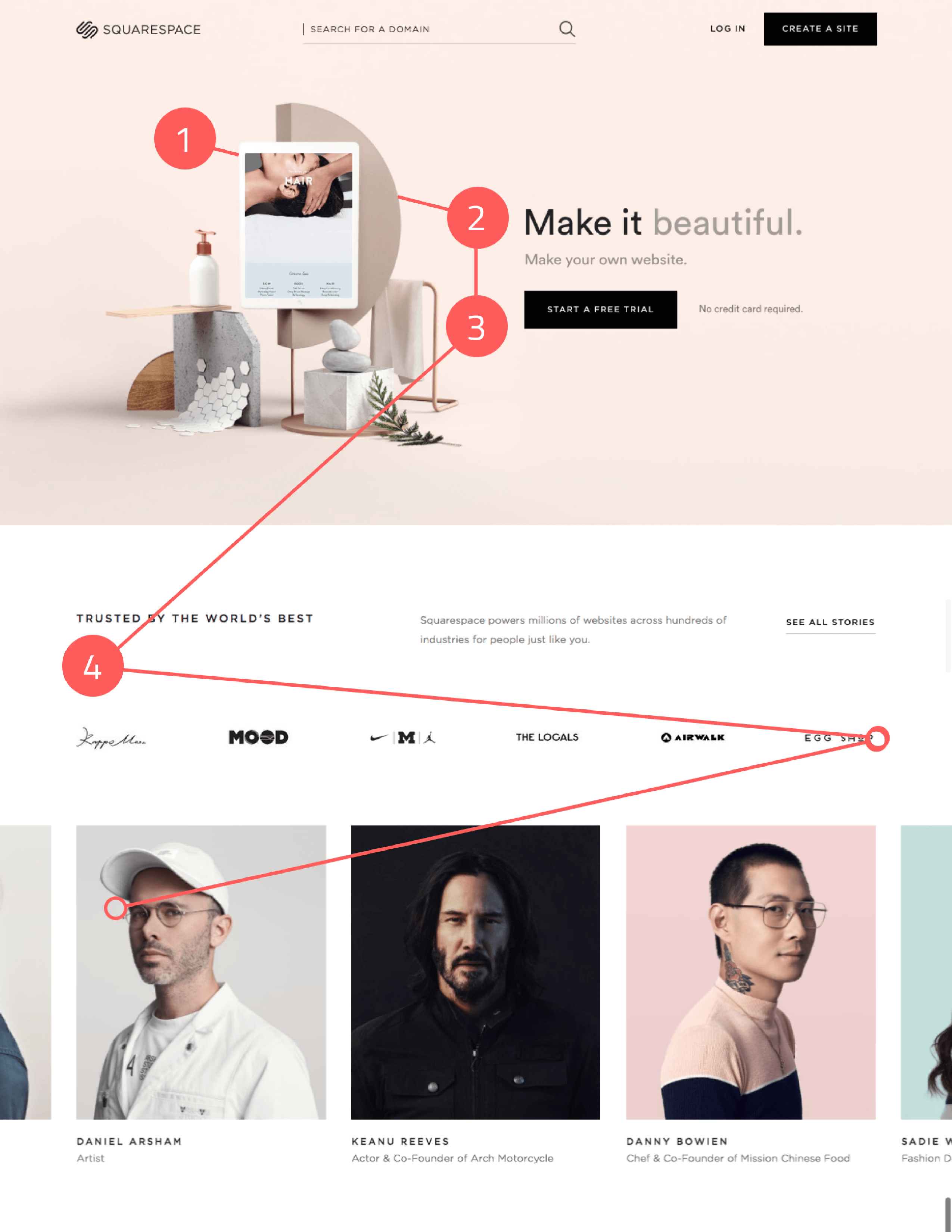
Based on this study on general web-viewing patterns, 96 of 120 participants stayed on the left half of the screen, while the remaining amount navigated to the right half. Because we read from left to right it makes logical sense that this is how we scan a website page.
If you don't design a logical viewing pattern for your website visitors, they can skim past valuable content without notice. However, establishing an elegant and effective design can alter the way a visitor scans your site.
You can improve visual hierarchy using different design basics such as typography, goal-oriented information architecture, color, size, and simplicity.
Visual hierarchy helps you organize and prioritize content so you can communicate a message to your audience with a better user experience. Without it, your business will suffer in showcasing value. That’s why it should be a key consideration throughout your design process.
2. Simplicity Improves Comprehension
It's important that your website visitors understand what you do and how you can help. A simple design can help your visitor achieve the purpose of your design.
Without it, your visitor can get lost or overwhelmed by so many different things happening on your website. For example, if you have four CTA buttons that all are in a relative position of each other and they all have the same style, how does the user know which action is most important to take?
If a user can't find the information they are looking for, they will navigate off your website.
That's why we want to design a website that is simple and easy to use. Airbnb does this well. They have a clear button hierarchy, effective use of white space, and purpose.
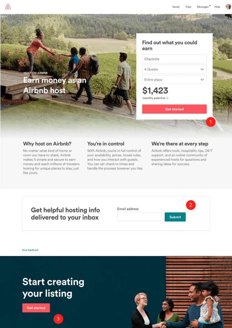
You can see that the pink buttons are more prominent, and thus the most important calls-to-actions. The teal button is the secondary option, which is another opportunity to gather my information if the first goal is not achieved.
What do you think the purpose of the page is? Based on the information and CTAs, it's clear to us that Airbnb wants users to:
- Find out what they could earn as an Airbnb host
- And then start the process of becoming a host (the get started button).
But how can you demonstrate simplicity effectively? Ensure that you're using white space, reducing redundancy of elements, and making your content scannable.
Overall, simplicity helps you get straight to the point, communicate your value, and help your user achieve their goal.
3. Color Impacts Personality and Organization
Color typically impacts mood, brand identity, and groups content together.
Color Communicates Your Brand Essence.
Take red, for example. It generally has negative connotations and meanings like danger, stop and delete. At the same time, it represents strong feelings such as love, passion, and rage.
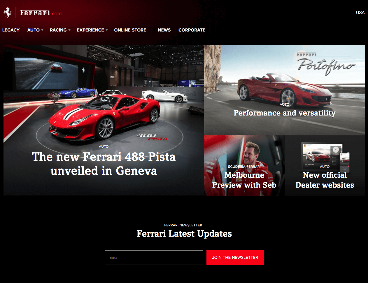
In the example below, you’ll see the home page of the brand, Ferrari. In this case, the combined use of red and heavy black emits luxury or exclusivity and can appear risky, daring, or rebellious.
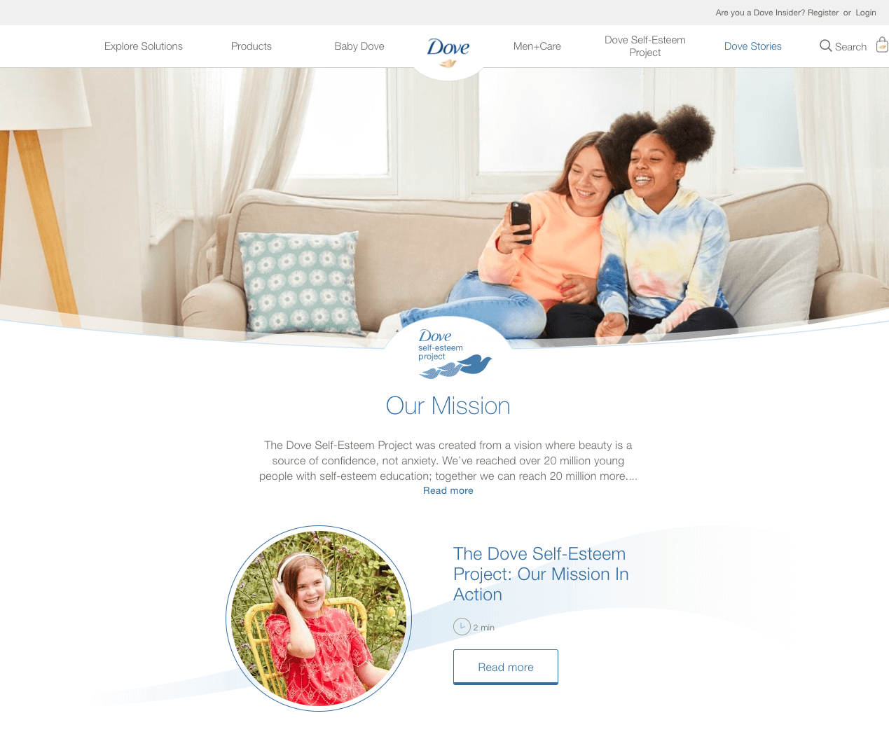
On the flip side, you have a brand like Dove, which demonstrates feelings like calm, happiness, and relaxation. The use of blue is associated with trust, relaxation, and peace. The addition of white appears to feel light, airy, and fresh.
All colors have a specific tone and feel to them. Yellow promotes happiness, but in excess, it causes stress or caution. Green is eco-friendly and associated with nature and cleanliness (that's why you'll normally see it used in hospitals). Orange represents comfort, warmth, food, and shelter. It's also known to increase your appetite! Additionally, orange stimulates concentration and focus; that's why you'll find it in test centers, exams, and for emphasis on your screen. It's not as harsh as red, yet still pulls focus.
Organizing Content by Color Forms Relationships
Let's look at an example from a company called BarkPost.
BarkPost
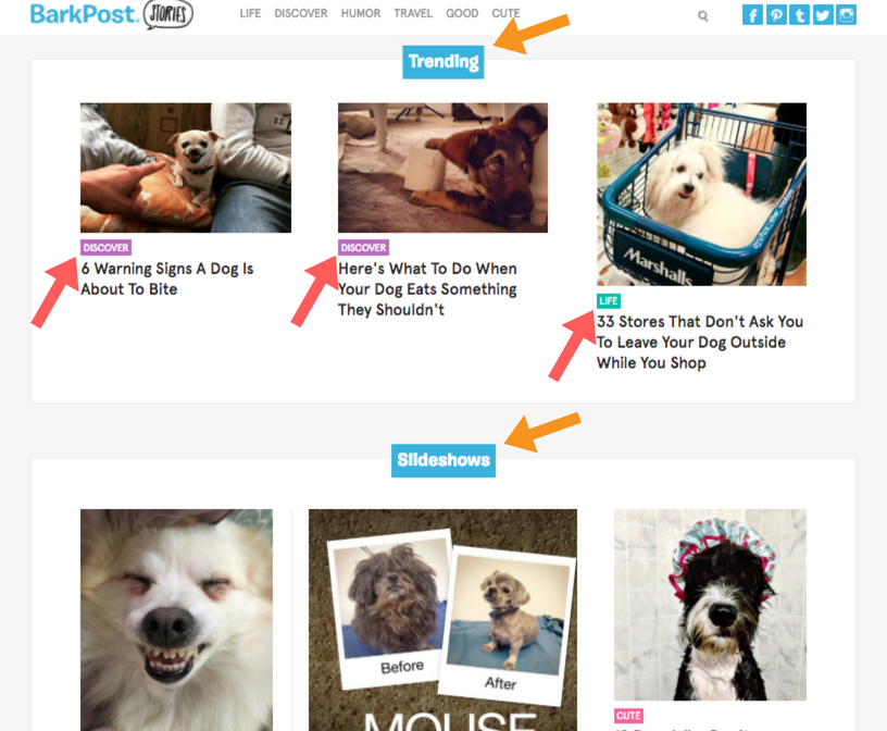
As seen in the image, BarkPost has different content types for their blogs - trending and slideshows (highlighted by the orange arrows). As you scan the page, your eyes quickly associate the white text and blue background with a section. Now every time you see that style, you mind is grouping that content together.
Next, you see the red arrows that point towards "Discover" and "Life." It's categorizing the different types of content into topics that you might find interesting. (Heck, we’re even grouping the two areas we’re going to talk about with two different arrow colors! It makes it easier to understand what we’re talking about, right?)
That's why color helps to create relationships within your content, improve comprehension and ultimately communicate your brand personality!
4. Misuse of Elements and Visual Effects Can Distract Your Viewer
Marketers and designers can easily mislead people by over-emphasizing elements through style. Imagine a designed element that calls so much attention that your viewer bypasses valuable information. On the other hand, proper use of visual elements or illustrations can help a viewer understand a complex subject easily. Are your visual elements distracting or helping them understand your content better?
A few design elements and visual effects that can break up your content and improve comprehension are lines, shapes, scale or size, pictures, and illustrations.
There you have it! Start using the power of design to ensure your message resonates, your brand stands out from the competition, and you build a loyal client base that grows your business. Always remember to first define your purpose. Only then will you be able to implement visual hierarchy, simplicity, color, and elements/visual effects effectively.
Not sure where to take your design next? Let’s chat! We love helping businesses uncover the beauty in their design and branding. Our expert design and creative team can sit down with you over what’s happening with your current site and make real-time suggestions that you can implement today! Sign up below!