
A website isn't just a hub of information for your B2B company; it's the single most important asset you have to achieve business goals.
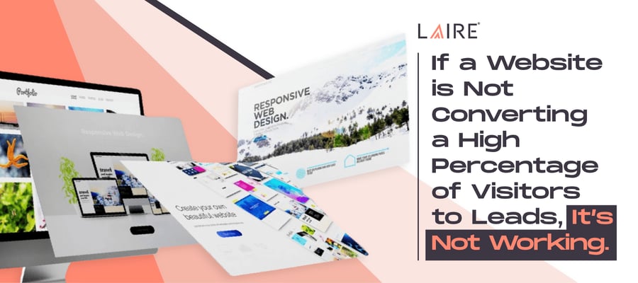
Just like a successful business, a website should consistently generate leads, revenues, and profits. If a website isn’t converting a high percentage of visitors to leads, it’s not working. It's not doing the job you're "paying" it to do. And the "why" comes down to your website design.
Have you built a conversion-minded website? Are you taking advantage of the opportunities given to you when a potential customer visits your website? To find out, take a look at how website design affects conversions and how you can ensure it's working for you.
What Is Conversion Rate Optimization?
Conversion rate optimization (CRO) involves merging established best practices with robust analytics to boost the percentage of visitors to your brand who perform an intended action. Specifically in the context of website design, this refers to increasing the number of website visitors who take a desired action.
The conversions that matter most directly influence your ability to meet business goals like generating sales-qualified leads or increasing revenue. You probably track these as key performance indicators (KPIs), so when you increase your conversion rate, you're impacting your KPIs as well.
CRO isn't exclusive to website design; it can be applied to various channels such as email marketing, social media, search ads, search engine optimization (SEO), and influencer marketing. Despite the diversity of these channels, they share a common destination — your website.
In essence, regardless of where your marketing efforts initiate, the ultimate goal is to drive traffic to your website. This shines light on the critical importance of a well-crafted website design, often overlooked in favor of other elements like reviews, social media, and display ads.
Some marketing plans neglect the significance of a tailored website design, relying on generic templates. However, it's crucial to recognize that if the website design is subpar, it adversely impacts the conversion rate. In other words, you're paying for a website that isn't working.
Two Types of Conversion Rate Optimization
Macro-Conversion Rate Optimization
Depending on your B2B marketing plan, macros could include:
- Downloading a case study
- Signing up for a free trial or demo
- Entering for a chance to win
- Buying the product/service through online checkout
- Contacting sales
As long as you have a strategy in place to make the most of these actions, each directly impacts your ability to meet goals further down in your funnel.
Micro-Conversion Rate Optimization
These are lesser conversions that add up to a total that’s greater than the sum of two parts when it comes to reaching B2B marketing goals:
- Following your business on social media
- Engaging with your posts (sharing, linking, liking, commenting)
- Subscribing to your blog or YouTube channel
- Downloading a second, third, and fourth case study
- Writing a review
Some of these micro-conversions may seem unnecessary when it comes to increasing revenues, but when you follow the data, you see that the micros build awareness and trust among potential customers. These directly increase your macro-conversion rate in two ways:
- Performing the action generates buy-in, leading to a conversion.
- These actions can generate social proof that influences many others to convert as well — and that can be even more powerful.
At the end of the day, your website design should help you achieve both macro- and micro-conversions.
How Website Design Impacts Conversion Rate Optimization
Every page on your website has a purpose and should have some form of conversion on it. Ultimately, if a page doesn't convert, it's not working, and your website design could be at fault.
Slow load times, confusing layouts, and cumbersome forms are just some examples of design elements that destroy conversion rates. Obnoxious fonts, colors, and general aesthetics can do just as much damage.
This all comes down to user experience. If you're not focused on delivering an effortless and intuitive one, visitors will leave without taking the desired action.
B2B buyers have power they didn't even 5 years ago. When a buyer visits your website, they know that many other options are only a search away. They have no reason to tolerate a bad website experience and won't take the time to get to know you despite it.
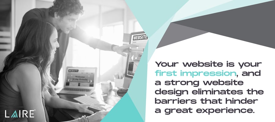
It's like a first date where you know immediately this isn't going to work. You'll have an uphill battle overcoming a bad first impression. Your website is your first impression, and a strong website design eliminates the barriers that hinder a great experience.
But let's look past creating a great user experience. The right website design can do more. It both guides a visitor toward the desired action and influences them to complete that action — in other words, conversion. This is the piece of the puzzle many are missing when they wonder why their fast, user-friendly website isn't bringing in new customers.
What Does a Converting Website Look Like?
A converting website can reliably attract the right audience and consistently convert them. As a result, a high percentage go on to become customers. This website delivers the experience that the visitor expects and appreciates.
Here's what that converting website looks like with the numbers to prove it:
- Fast: A Deloitte study found that increasing mobile speed by just 0.1 of a second could increase conversions by up to 10%.
- Responsive: 73% of web designers say lack of responsiveness is the number one reason sites don't convert. But that's web designers. Let's take a more objective look. As it turns out, 50% of customers agree. They say that bad web design is a problem holding many businesses back.
- Easy to navigate: 42% of website abandonment happens because of poor website navigation. It's no surprise that 38% of customers say navigation is the first way they judge a site.
- Aesthetically pleasing: 85% say crowded websites are the top web design mistake small businesses make. 21% say over-the-top color schemes will make them leave.
- Composed of clearly defined pathways to conversion: These conversion paths deliver predictable conversions.
- Instantly trust-worthy: Design elements like location transparency, functionality, social proof, and customer reviews account for 75% of a website's perceived credibility. These mean more to customers than anything you could ever say about your brand. 48% of customers say a bad web design equals a lack of credibility.
- Designed with both people and search engines in mind: A converting site is also one designed with SEO in mind.
- Undergoes regular A/B testing and optimization: A high-converting site doesn't just happen because you applied best practices. It's optimized through ongoing testing and reiterating.
Choosing an experienced web design agency is a smart investment because it means you get more value for your money. Just look at the numbers — they make a clear and convincing case for this investment, not just for you but for everyone leading your organization.
How to Leverage Website Design to Increase Conversion
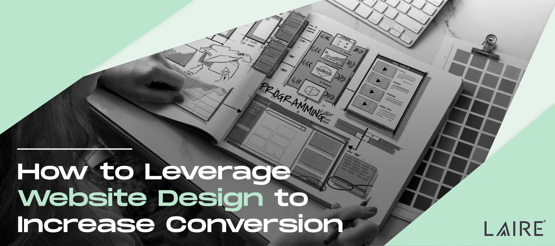 Start by applying the following best practices for web design. Many are low-hanging fruit you'll wish you'd done earlier to boost your conversion rate instantly.
Create Focus
Your website has a goal; every page does its part to work toward that goal.
A page’s focus could be a micro-conversion or macro-conversion, but whatever it is, be sure you know what it is you want the page to do and that everything on the page works toward that mission. If you have multiple calls to action, they should all lead to the same conversion.
Avoid Choice Paralysis
Too many options create hesitancy. Avoid suggesting that someone consider multiple paths at once. Instead, use images, layouts, and CTAs to guide them toward one conversion. Because you know who your target audience is and why they've landed on your page, you can guide them toward the most helpful solution.
Use White Space
White space is space with nothing in it, and it may or may not actually be white. White space helps the eyes focus on what's important on the page and not become overwhelmed with information.
Create Brilliant CTAs
A brilliant call to action (CTA) clearly states what you want a person to do. It grabs attention through design, placement, and action-oriented language.
Make your CTAs stand out with buttons, colors, and directional cues like using an arrow instead of a bullet point. Test CTAs to identify design elements that get the most conversions.
Have a Consistent Style
No matter what page the visitor clicks on, they should always know they're on your website. Unify the visuals to create this seamless experience. Each touchpoint on your site fills the trust meter of your visitor. Avoid jarring the visitor, which can damage that trust.
Guide the Visitor
You don't have to be salesy to have a high-converting website. Subtly guide the visitor to keep scrolling, and keep on engaging by crafting an effective information hierarchy. Balance information with visually appealing elements to create a sense of "comfort" on your website.
You've attracted this B2B visitor for a reason. They should feel they belong here. They're learning actionable information you've laid out in a way that is easily digestible and memorable. It gives them a reason to want to learn more about you and the helpful information you have to offer.
With the right website design, taking the desired action (saving, downloading, subscribing, following) becomes the natural next action.
Make Your Benefits Stand Out Immediately
A person can process a clear visual in 13 milliseconds, while the typical person can only read 4 words a second. In comparison, the image can equal an instant understanding of a complex idea.
Create a hero image that conveys at a single glance the benefit the visitor can expect from working with you. Don't overcomplicate it or try to show too many benefits.
Additionally, use the best medium for the job. Sometimes a photo, illustration, or video works best. Sometimes people, animals, robots, or inanimate objects make the case.
Strategically Place Testimonials
84% of people trust online reviews as they would a personal recommendation. Placing reviews at critical points on the site can increase conversions. However, people are skeptical of reviews that may not be authentic.
From a design perspective, high-resolution headshots of the reviewer smiling with shoulders visible and full names and companies deliver trust signals to the visitor that can lead to more conversions.
Shorten Forms
Of course, you want to know everything about a person so you can deliver the most relevant experience, but too many form fields can lead to form abandonment. Ask essential questions only.
One way to reduce unnecessary fields is to align forms with their purpose. Also, consider what information you can easily collect later, such as location.
Think User-First
Put yourself in their shoes and think about how they'll use the site. If you've ever said to yourself, "A 3- to 4-second load time is fast enough," be honest. As a busy professional, would you stay on a site with that load time?
Use this insight to build a fast, user-friendly, responsive, mobile-first website that works as the visitor expects. Identify and eliminate barriers to a great experience. These are also barriers to conversion.
Employ data to uncover unknown barriers and track how making a change increases your conversions and the revenue you generate once that sales-qualified lead closes with sales.
Out-of-the-box website design platforms can't do this. As soon as you add the basic features you need to generate consistent conversions, they become slow, unresponsive, and poorly converting fast.
How to Improve the CRO of Your Website
The key word here is "optimization." Best practices get you in the vicinity, but you can't optimize anything without:
- Collecting data
- Analyzing data
- Making a data-driven decision
- Collecting and analyzing again to make sure you got the result you expected
- Continually revising and adapting
This is optimization. Here are some tools an experienced web design agency like LAIRE uses to optimize your website.
Heat Mapping
This technology tells you where people dwell on a page. It takes the guesswork out of what's not working on the page, saving you time and money by more quickly delivering a web design that converts.
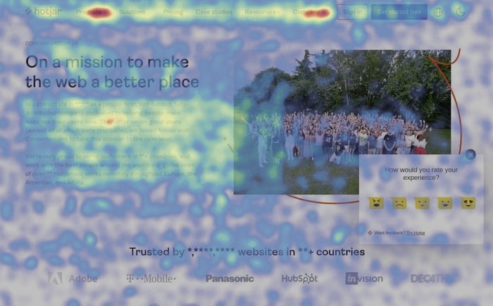
Through it, you can clearly see if the above web design best practices work for you and adapt them to get more out of your website. You can identify issues and optimize the customer's journey through your site. Use heat mapping to:
- Eliminate unintentional focal points
- Fix or get rid of elements causing hesitancy or confusion
- Insert trust signals (like a review) where people often back out
- Correct poor usability annoyances
- See how well you're guiding the visitor through the content
- Know how people "read" your blog posts, landing pages, and other content to craft a winning information hierarchy and increase time on page, engagement, and conversions
A/B Testing
Heat mapping focuses your efforts, but it doesn't always tell you how something could be better. A/B testing or split testing is the act of distributing two versions with one small but significant difference between them. Examples include:
- Using an orange button instead of a red one
- Mentioning one specific benefit over another
- Choosing between different hero images
- CTA placement
- Headline copy
Track performance and compare the conversion rate between the two to know if one performs better than the other. Keep in mind that you’ll also want to ensure the difference in performance is statistically significant.
All in all, through A/B testing, you can apply what you learn to other pages and make data-driven decisions to continually improve your website's performance.
Tracking and Analytics
Optimization is a continual process. Industry trends, user preferences, and advancements in technology can change what the highest-converting website looks like over time.
Through tracking and analytics, a professional web design agency like LAIRE can make data-driven design decisions to help you:
- Increase the quantity and quality of website visitors
- Keep visitors engaged on your site longer, building trust
- Optimize each page's conversion rate to generate more leads
- Keep your website current and meet important short-term and long-term goals, like driving revenue and increasing customer lifetime value
- Ensure your website delivers the highest possible return on investment
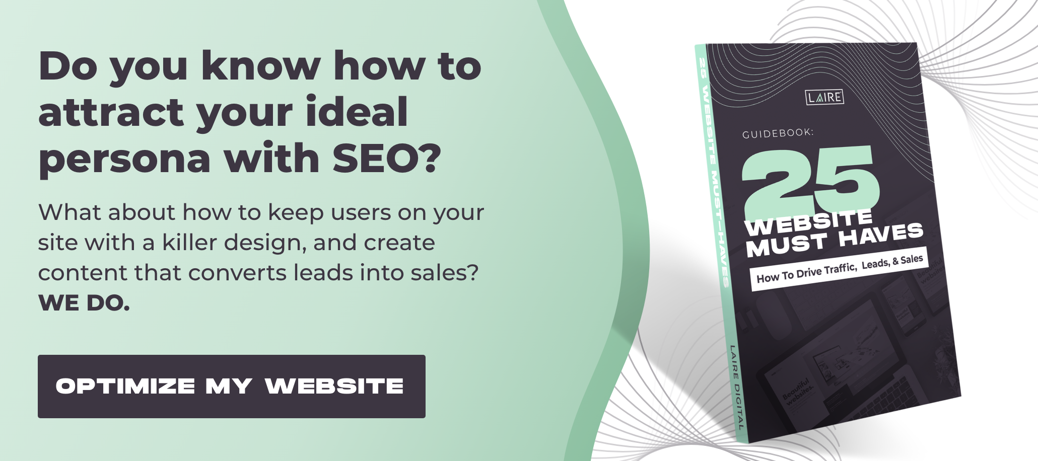
Interested in learning more about designing a website that can do all these things? Grab your free guide to find out the 25 things every great website must have.