
Customers judge your business every day, starting with how it looks and what it says. Knowing that branding is your first “hello” to a potential client, it can really pay off to spend time assessing and updating your current brand to connect with who you really are, and who you want to reach.
Just like many business owners, we had downplayed the importance of our own branding and pushed the project to the side because we were too busy focusing on getting our clients results. However, you can only go so long with an outdated logo, brand voice, and website before it starts to hurt your business. As a creative agency, the longer we failed to look inward and adjust our outside appearance, the more it was going to affect our confidence in promoting our company.
Reasons to Rebrand a Business
If any of these five reasons fit your business, it’s time for a rebrand:
- Your business has evolved and current branding no longer reflects your mission or product offering
- The competition is smoking you, and your brand is not standing out in the market
- Times have changed and your current branding looks outdated
- You’ve merged or acquired another business and NEED to rebrand
- Your brand doesn’t represent the spirit of who you are as a company and team (AKA you’re embarrassed by your business card like we were.)
Reason #5 is the real reason we made the time, set aside funds, and focused heavily on every aspect of our brand. We dove in headfirst and haven’t looked back. We rebranded everything: our name, logo, tagline, website, promotional items, and even our agency headquarters, we affectionately call “The LAIRE.”
We’ll walk you through some of the steps in our brand logo design process and the overall branding strategy, sharing some insider info so you can see how we landed on our new brand identity. Hopefully, our branding journey will inspire your company to get a fresh new look, reap the benefits of a positive brand impression, plus experience the growth in sales that follow a big rebranding project.
Our Branding Evolution
Laire Group Marketing was founded out of our initial company Laire Group, Inc. in 2006 (then rebranded to Charlotte Social Media in 2012). We were growing and tackling more than just websites and social media management. Content and inbound marketing had become our newest addition to the already growing agency offering and we felt we needed to add another company. Not only were the services changing and growing, but also our team and ultimately our identity.
We started the transition slowly, by placing our new name, Laire Group Marketing, into presentations, next to our existing logo for the sister company Charlotte Social Media. And we admit it, the look for the new name was created quickly in Microsoft Word:
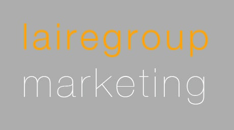
We didn’t know who we would morph into becoming, so we just found some fonts we liked. We figured that once we knew more about our new identity, we’d create a full brand identity to go with it. No shame – this is the way a lot of businesses start. You’re moving too fast to worry about a little thing like branding.
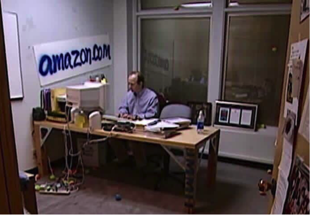 Jeff Bezos in 1999
True story: an Inbound Marketing conference was looming and we needed to order business cards FAST for networking. We knew we couldn’t spend money on printing a logo that had been created on the fly so we held our first mini “Branding Workshop”, if you can call it that. It went something like this:
“I want these fonts.”
“Look at how cool this other company’s logo is. Can’t we look like them?”
“My favorite colors are orange and bright green. Oh, that looks like peas and carrots? Let’s add in some blue.”
“How about a chart that can symbolize growth, moving up and to the right.”
“Yeah, that looks cool.”
It took a couple of hours using a design program to create the logo we would use for the next 5 years, growing from 2 employees to 15, with countless client successes over that time.
Along the way we’d hear little comments from our team members or vocal clients:
“I thought you were a law firm”
“You’re so creative! I would expect a different ‘look’.”
“Sure is tough to use all 3 of those brand colors without looking like a circus.”
In 2019 a new team member mentioned that her mom thought our “logo and website were outdated", and it gave her pause that her daughter was looking at working for us. That was right at the start of the rebrand project and solidified our resolve that we HAD to make time and resources to make it happen sooner than later.
We knew that the brand we had created in a pinch could not stay in place for the long haul, and did not fit who we had finally become: a creative and strategic agency delivering growth in sales and marketing for our clients. We also knew we wanted to simplify the name. Laire Group would become LAIRE, Inc., a digital growth agency – still recognizable, less ambiguous (and maybe removing the ‘Group’ would stop the law firm or real estate references).
Over the years we have successfully branded and re-branded many of our clients with our amazing team of designers and marketers. Now, we have developed a proven digital brand strategy to capture the essence of who our clients are and translate that into a strong brand story. We were so happy we were finally able to be the client getting rebranded!
Applying Brand Strategy
It was time for the cobbler to make his own shoes, and we applied our proven branding process to our agency. We started by gathering the whole team to participate in a Branding Workshop with the owners where we went through a really fun and interesting brainstorming session that asked questions and guided discussions to find patterns that would develop into our new identity.
LAIRE Branding Project Process
- Group Brand Development Workshop
- Explore the history of the business’ brand
- Complete the Branding & Voice Questionnaire
- Collect inspiration from other brands
- Complete the Archetype Survey - Agency Design Brainstorming
- Present Concepts and Designs
- Create a Brand Voice Document
- Present Revised Concepts and Designs
- Final Designs Decided
- Brand Standards and Guide Created
The Brand Development Workshop gathers A LOT of information.
We’ve included some of our more interesting responses from our own workshop here for your entertainment, and don’t laugh -- brainstorming sessions are safe spaces!
Words that represent our brand:
Creative, Down-to-Earth, Fun/Cheeky/Witty, Smart, Approachable, Caring, Problem Solvers, Detail Oriented, Collaborative, Hands-on, Attentive, Challenging, Invested, Inventive.
Words used to describe our brand’s image:
Stylish, creative, artistic, cutting edge, clear cut, direct, holistic, comfortable, trustworthy, low-stress, relaxed, collaborative.
Other brands our brand would be friends with:
HubSpot, Apple, Moka Cafe, Zoom, Zappos, Jet.com, Slack, AppSumo, Big Ass Fans
Places our brand would hang out:
Coffee shop, the park, whitewater rafting, yoga class, the gym, craft brewery, Juicery, taco truck, farm to table restaurant, on a boat, surfing on the beach, snowboarding, hiking
This actor/actress would be perfect to play our brand:
Ashton Kutcher (casual but conscious), Jennifer Garner (driven and funny but conscious)
Our brand would be this kind of car:
Tesla, all-wheel-drive, VW bug, and Subaru, Jeep – anything you could drive on an adventure.
Animals that would represent our brand:
Dolphin (Smart), Golden Retriever (Reliable Good Boy), Monkey (Inquisitive)
These colors represent our brand:
Blues and greens (calm and innovative). Peach (warm and sunny). Dark purple grey (creative instead of plain black). Think island sunset on a beach with green mountains and palm trees.
There were many more questions we answered and discussions we had during the workshop, but you get the idea and hopefully know a lot more about who we are. We then answered a lot of questions to discover our brand archetype, which casts your brand as if it were a character, to attach a more human personality to the brand you are creating. There are 12 archetypes, and the LAIRE Archetype quiz along with our chart below tells you which archetype you are. We fell into the “Explorer” and “Creator” archetypes. Yeah, we see that.
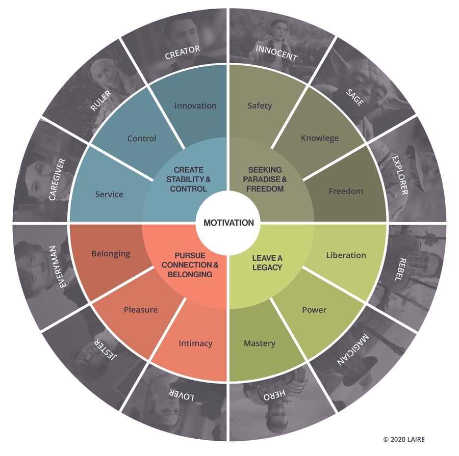
Here’s what those archetypes mean for our branding:
Explorer Archetype – Keyword “Freedom”
THINGS: Compass, Globe, Map, Route, Magnifying Glass, Nature, Trees, Boat, Ocean (naturally :))
PEOPLE: Christopher Columbus, Darwin, John Glenn
COLORS: Blue, Green, Brown (wood is our brown)
TRAITS: Open-Minded, Exploring ideas, Intelligent, Analytical, Fearless (Yes that’s true, we jump out of airplanes to skydive and snowboard off cliffs. Daredevils make great marketers.)
Artist/Creator Archetype – Keyword “Innovation”
THINGS: Art Supplies, Paintbrush, Easel, Sun, Lightbulb, Wheel, Cogs, Gears, Hands, Tools
PEOPLE: Tony Stark, Lady GaGa, Davinci (That’s a match made in heaven!!!)
COLORS: Spectrum, Purple, Orange (This is why we drool over sunsets!)
TRAITS: Inspirational, Boundless, Positive, Perspective, Unique, Imagination, Observant, Fearless, Problem Solver, Choices, Collaborative, Hands-On, Lighthearted (The qualities you need to reimagine and create new brands that not only inspire but sell.)
Rebranding Our Own Agency
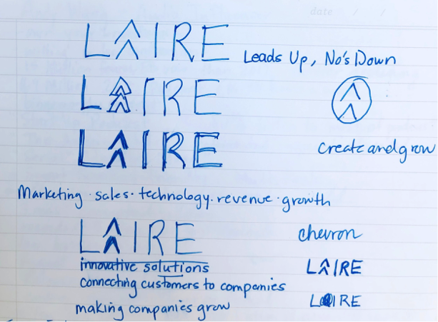
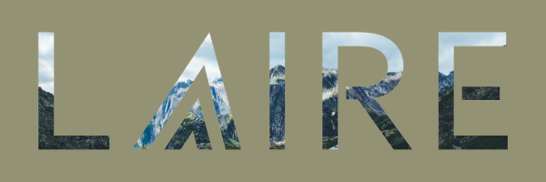
While at an Inbound Marketing Conference (again) with Todd Laire (Husband and LAIRE Cofounder) we were talking nonstop about the new brand and what it should look like, what the tagline would be, and whether or not to have an icon. Being an artist by nature and Creative Strategist at LAIRE, I couldn’t help but scribble out some ideas for our new logo. I’m not a graphic designer, so I knew we’d need help from our talented design team to digitize and refine the ideas we had. We knew we wanted it to be the name LAIRE and incorporate an icon. We thought the "A" was the best candidate to have upward motion and become the icon, whether it was a chevron pattern, arrows, or upside-down V shape was still to be determined.
Check out the first iterations I scribbled out while taking notes at the Inbound Marketing Conference with Todd that very day. Some of the original tagline ideas were things like “leads up, no’s down” and “making companies grow.” We decided within a very short time that the tagline would be Leads to Growth. No brainer there. LEADS is what everyone is looking for. We have always been really good at generating amazing tag lines and logos so we knew this would be really fun and exciting for us to work on our own.
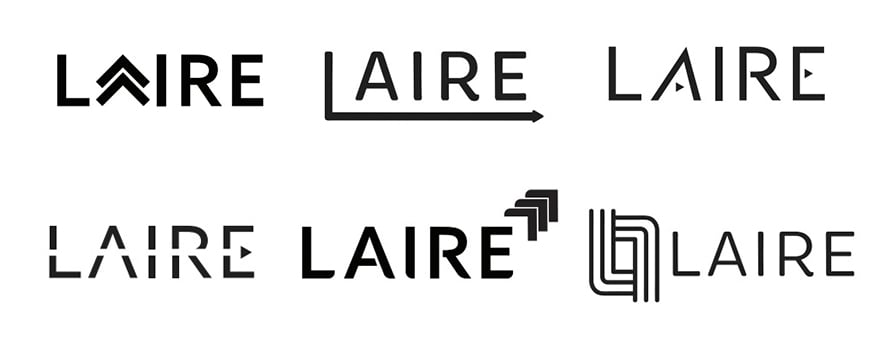
We took all of the answers, words, feelings, moods, colors, and preferences about our brand, and started getting creative with our design team. We went to work capturing and conveying our ideas into logo designs, letter shapes, and colors. We knew that we wanted to show movement, growth, and creativity, with a mix of bending the rules and structure (some of our keywords from the workshop). Our designer started designing in black and white, so we wouldn’t be swayed by color, yet.
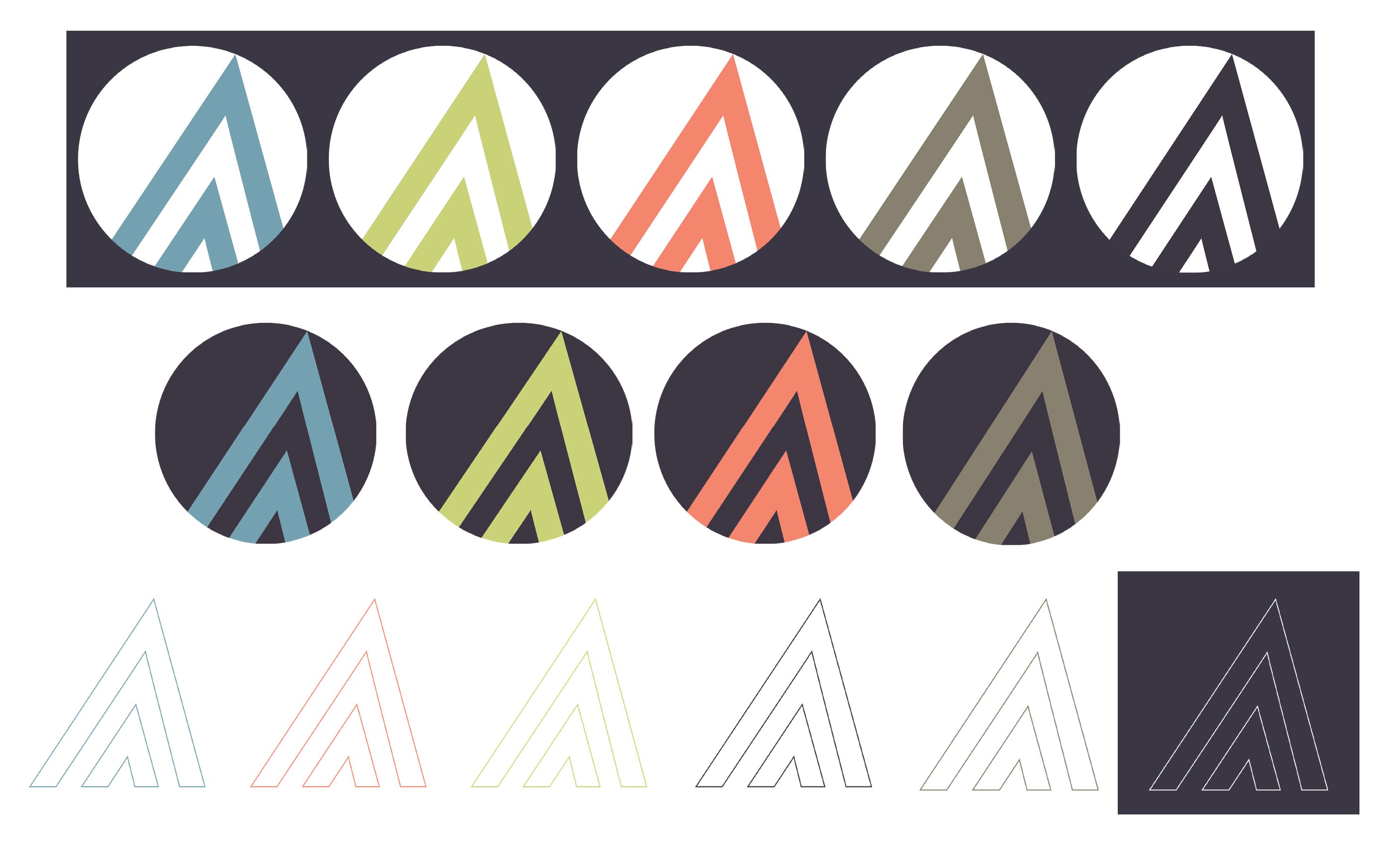
Here’s a sampling from our design brainstorm:
After many iterations and refinements, We shaped LAIRE and our icon until we finally had our new logo with a descriptive tagline:
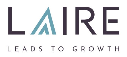
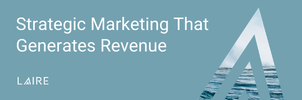
We created structure and creativity in our letterforms by adding spaces in the R and E, and also included movement and the representation of a pinnacle in our double “A”. Todd grew up in the Northwest near Mount Rainier, so this idea of a mountain has a special place in our heart and we wanted to make sure to represent it.
In a way, our “A” represents the mountains we climb (or snowboard down) as we help to grow our client’s businesses. For some of us it’s a mountain, for others it’s an upward arrow. Either way, the service we provide “leads to growth”. And because we are a lead-generation agency, our tagline has another important meaning. LEADS. And who doesn’t want more leads?
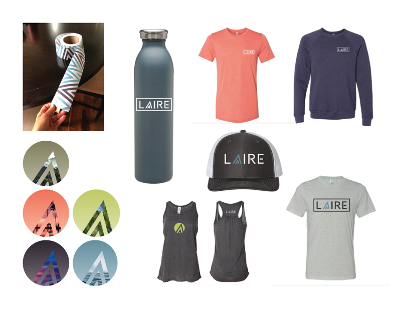
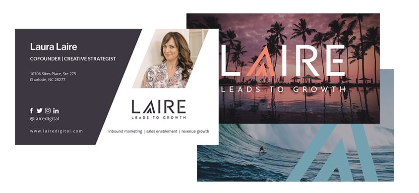
We have many ways to represent our brand and support messaging with our new super cool and vacation-worthy color palette. Picking and naming the colors was the best part. This is something we wanted to make sure gives you all the feels when you see them. Don’t you feel like you're celebrating the growth of your business with a martini on the beach?
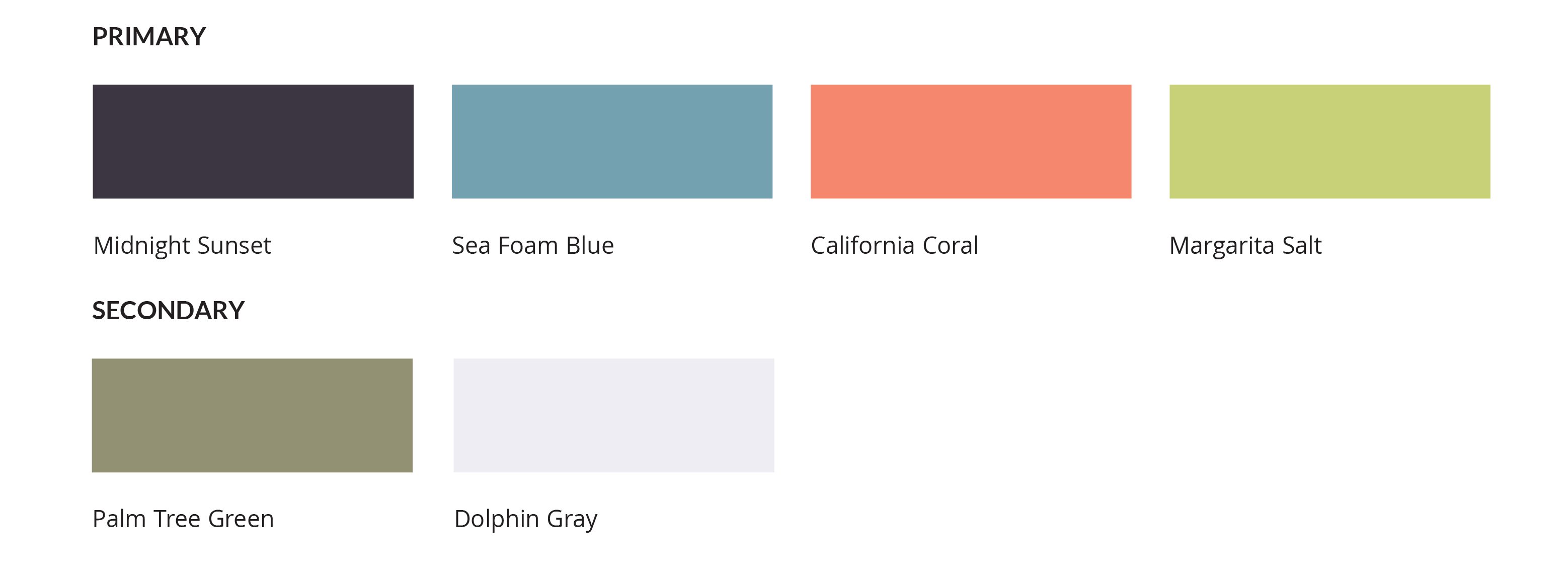
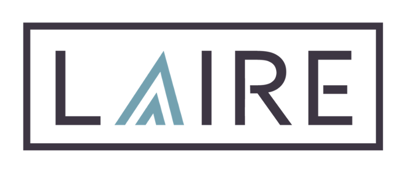
We decided to use the logo with each of our new colors or change the icon color as needed. We even like to put a box around it when it’s all lonely on a page or on swag to make it stronger. We had fun creating sections of our website to go with each color. This time we have rules laid out in our brand guide though, complete with – you can only use 2 colors together at a time! No need for a box of skittles, please!
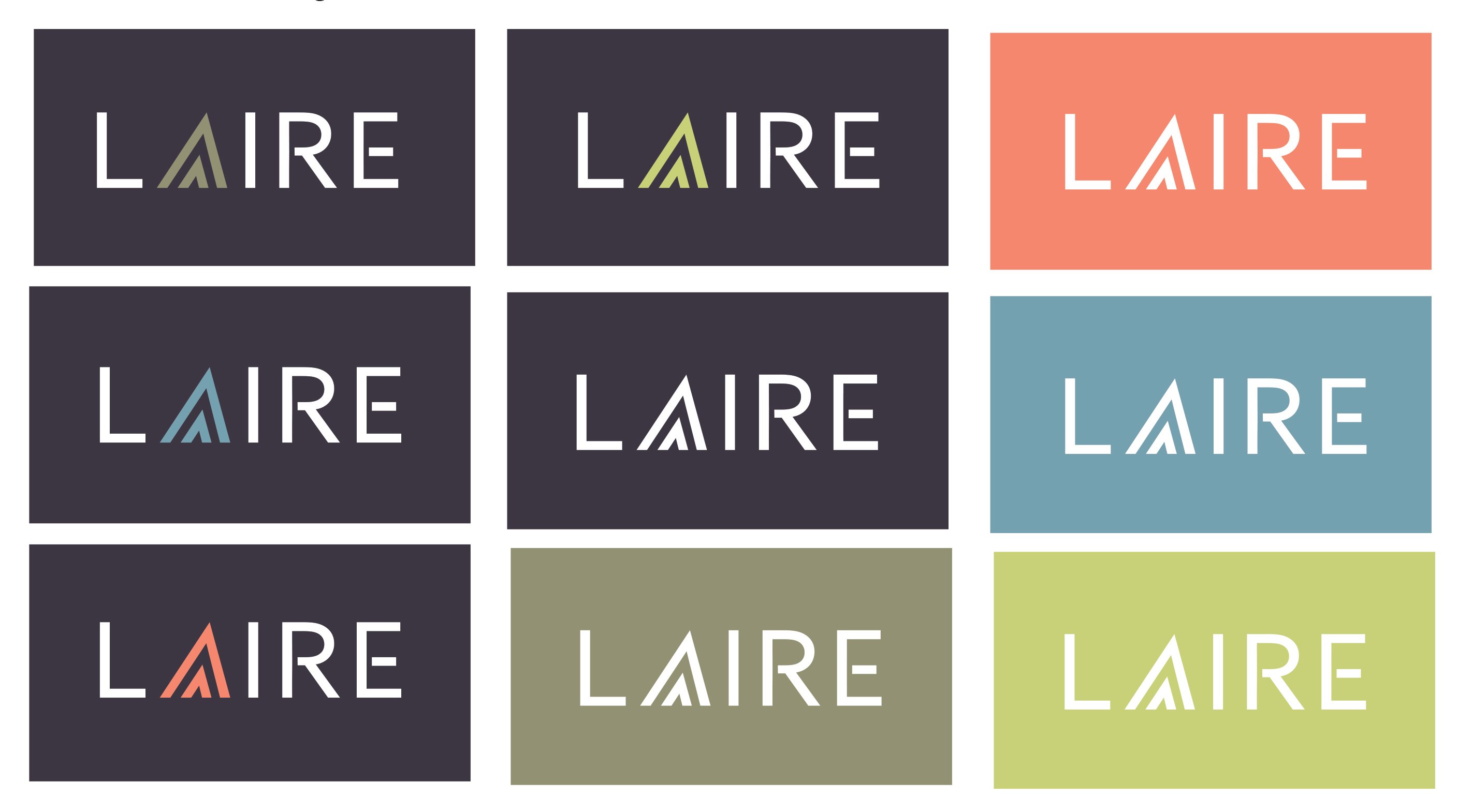
Using a stand-alone mark, the "A" from our logo, gives us creative ways to put our stamp on marketing materials as well as promotional items like cool T-shirts we pass on to our clients. (One of the many perks of working with LAIRE. We make you look cooler and feel more comfortable in your day to day.)
The fun part of branding is creating, gifting, and wearing all the swag! Not gonna lie, we are the coolest cats in town.
LAIRE Leads to Growth, and a Better Quality of Life for Business Owners!
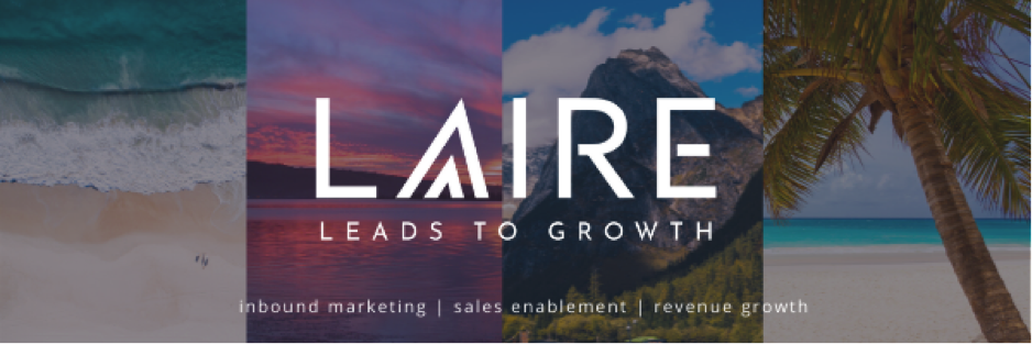
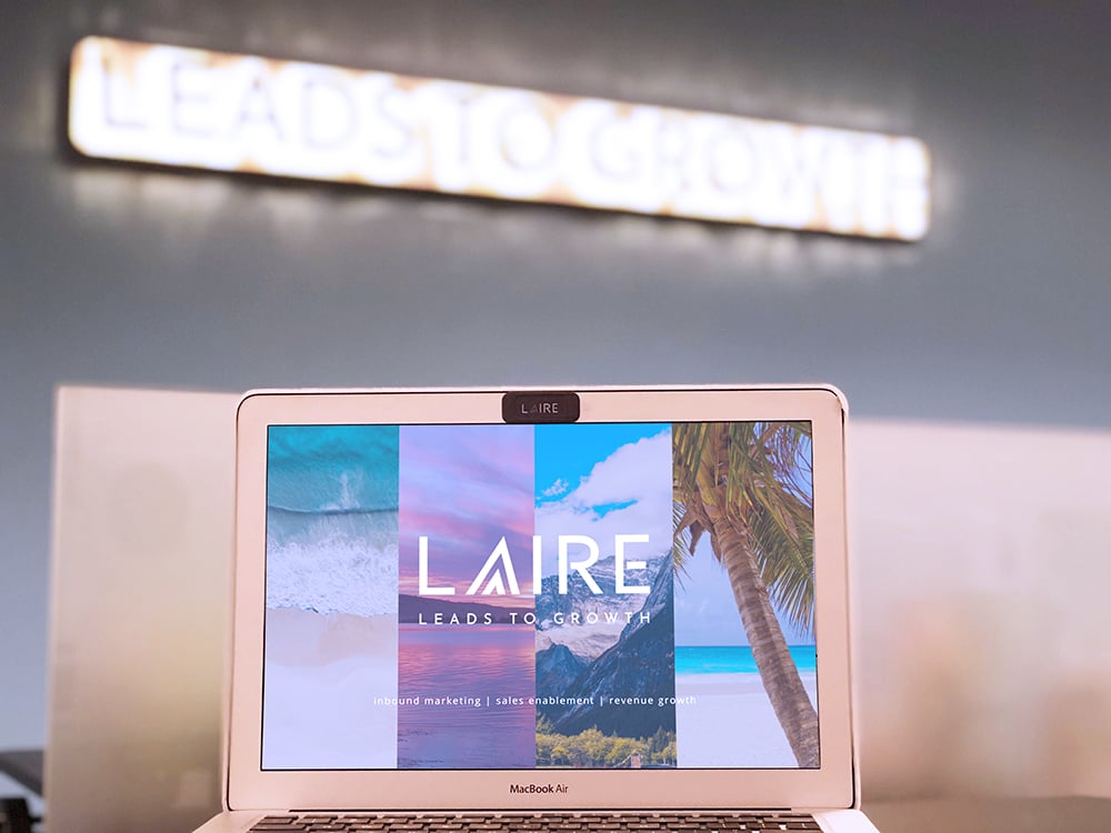
In the process of working on our branding, we finally vocalized that our clients (business owners) use our services to get revenue results, so they can eventually relax and enjoy the good life. That’s when aspirational imagery made its way into our branding. We’ve all seen plenty of fingers on laptops in marketing photos but we wanted to take our laptops to the beach in this “work remote” or “work anywhere” world we live in now. We take our clients on a vacation in their mind, and get them to equate lead generation and revenue growth with a bigger payoff:
- Working with LAIRE enhances your quality of life - both personal and professional.
- Working with us is a breeze.
- Take a load off, we got it from here.
- Sit back, relax, and enjoy the ride.
- Retirement is in sight when you work with LAIRE.
As you journey through our new website or run across our graphics on social media, you’ll notice the imagery takes you somewhere in your mind that we can take you to in reality - through inbound marketing, sales enablement, and revenue growth you can stop working so hard on your business end enjoy the good life.
Now, I finally have a business card I’m proud of with 50 different backsides for a variety to hand out to prospective customers! The first person I gave a card to said she wanted one of each design. They are too cool and very memorable.
We created a comprehensive brand guide that summarizes and outlines our brand voice, rules for using the logo, brand colors, and fonts which is the final product of our branding process.
After a lot of hard work, we are happy to introduce the new LAIRE brand and embrace our updated brand identity in everything we do. Like any good brand strategy, it will continue to evolve as we do.
If you are ready to take a new look at your company’s branding, let’s discuss your options for all that it can be, how it can contribute to the growth of your company, and even add a really sweet vacation in your future. We'd love to be your brand marketing agency and growth partner.