

Planning and making in-the-moment data-driven decisions are critical to the way modern business works. Customer trends, competitors, website ranking, social media engagement — it's a lot to keep up with. And hovering over individual reports in real-time often provides little big-picture insight. But it doesn't have to be this way.
Data visualization tools can pull key data points from many reports and present them in an easy-to-understand visual way for both internal and customer-facing content.
What is Data Visualization?
Data visualization is the use of charts, graphs, and other visual media to display many critical data points together in a way that shows the interconnections, outliers, and trends—giving meaning. It tells a story through data. The goal of data visualization is to make that information more quickly and completely understood, to gain insights, and clearly communicate with others.
Data visualization tools allow you to manually generate visual representations of data. You might use this kind of data visualization to create visual content for your audience. But many can also allow you to customize and automate the creation of visuals based on many data sources.
Both kinds of data visualization are becoming increasingly accessible to all business sizes.
Why Is Data Visualization Important?
Visuals allow you to make faster, more data-informed decisions—in real-time when needed. And making data visualization marketing part of your web growth-driven website design helps you more effectively engage and convert leads and close deals.
Companies have invested heavily in better data collection for many years. But analysts estimate that around 63% of that data goes unused. Some believe the rates are much higher. A 2020 McKinsey study found that as many as 40% of the reports companies run on a schedule never get looked at. We're collecting the data. But who has time to go through it all, or better yet, make sense of it?
Putting data into a useful form is just as important as collecting that data in the first place.
- An MIT study found that 90% of the information the brain processes is visual. You can process an image in 13 milliseconds.
- That's 60,000 times faster than text, according to a University of Minnesota study.
- The average person is expected to process 5X the information daily versus someone in 1986.
Summary: Society and business culture expect us to make logical, data-driven decisions. But we're trying to process more with the same brainpower. We have to be more efficient about it... or it's not humanly possible. Visuals are an efficient way for the human brain to process a lot of data.
This is true both internally and for your B2B customers who are just as overwhelmed by data as you are.
So, it's no wonder data visualization marketing is quickly becoming inseparable from decision-making in many organizations. This automated visual representation of information is integral to their ability to meet goals, understand customers, forecast trends, and make data-driven decisions.
Types of Data Visualization & How to Use Them
Effective data visualization should quickly convey a message, supporting decision-making for you, your team, your C-suite, and your customers. So, different types of data visualization work well for certain kinds of data. Always be purposeful when choosing a type of data visualization.
Just take a look at these types of data visualizations and how companies use them to communicate both internally and with customers. And this isn't even an all-inclusive list.
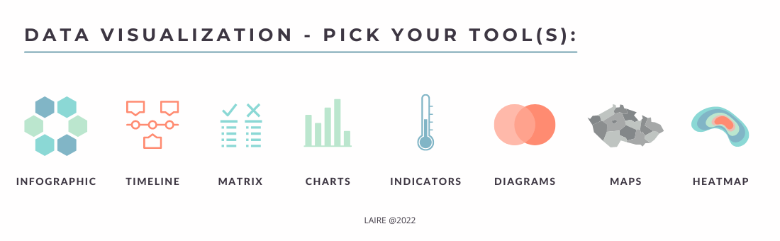
- Infographics. Tell a visual story by highlighting important stats, facts, tactics, or characteristics in a way that people remember them.
- Timeline. Show how a project or event progressed to understand the turn of events, roadblocks, milestones, and steps to reach a goal in time.
- Matrix. A spreadsheet-like set of rows and columns that allows you to compare many traits across two or more groups. E.g., You could visually compare HubSpot to Salesforce traits by looking at cost, ease of use, customizations, integrations, customer support, and aesthetics side-by-side.
- Charts. Use this visual to compare two or more data sets. Show how things changed over time. Or showcase a correlation between two or more data points. E.g, pie chart, bar chart, column chart, line chart, funnel chart, area chart. Each has its unique advantages.
- Indicators. Track a change over time to show which direction it's moving and progress toward a goal. E.g., a fundraiser meter. A non-digital speedometer is an indicator.
- Diagrams. Create connections between ideas and actions to map out a process and establish cause and effect, or to promote creative brainstorming in a group. E.g., Venn diagram, workflow diagram, org chart.
- Maps. Display information that is geographically dependent. E.g., scatter maps, and shaded states.
- Heatmaps. Show where a particular event happens most. E.g., crime map. In marketing, we use heatmaps to show where website visitors focus most of their attention on a web page.
Then you have the mother of data visualization, the Dashboard. This is a single-page view with multiple data visualizations that display performance across several KPIs. Just like one chart tells a story, the dashboard presents multiple visualizations to show how those stories create a big picture.
It allows you to track, understand, and as needed, respond to information without having to bounce around between screens, wasting time. A dashboard is essential to data-driven decision-making. To get the most out of a dashboard, don't leave it on default. Customize dashboards based on business goals.
Benefits of Data Visualization
Boost Content Marketing Efforts
Data visualization helps your business get the most out of data and keep up with the top trends shaping the future of marketing. Among these trends, is the need to create higher-quality content. Data visualization tools can help you create more impactful, shareable content. Blog posts with an image every 100 words get 2X the social media shares and social media posts with images get 2.3X the shares.
Of course, you could use a generic image. But why? Data visualization has added benefits you'll want to tap into, especially as a B2B marketer. It improves storytelling. Communicate your brand's Unique Value Proposition (UVP) visually to increase conversions, leads, and revenues. Make the content more engaging.
Studies show that visuals help people comprehend and retain more.
Create more dynamic blog posts, online events, white papers, case studies, and short-form videos with visual representations of first-party data.
In B2B, you're speaking a decision-maker's language when you visually represent your UVP. For example, in manufacturing, instead of telling decision-makers something, you can show them why they need your product or service in their terms, by visually representing its impact on:
- Production line's performance (Units, Time, First Pass)
- Operating conditions (noise, temp, humidity, etc.)
- Overall Equipment Effectiveness (OEE)
- Individual productivity
Breaks Up Complex Data Into a Digestible Format—for Everyone
You're dealing with a lot of complex information and multiple reports. Data visualization helps you bring it all together and portrays data in a purposeful manner. Share a lot of information people will retain without overloading the brain. This benefits everyone:
- Team. Convey information to your team faster than you could in words. Present personal and team performance data visually.
- C-suite. Clearly and more dynamically communicate ROI, deals won, channel performance, and overall performance to C-suite in your quarterly marketing reports. Present your case and support your decisions with visual data. Prove marketing ROI. If you automate data visualization, you'll also spend less time prepping for quarterly meetings. No more spending hours or days creating charts for your slides.
- Managers and other leadership. When you automate data visualizations, you have more regular access to the data you need to make smart decisions. Always see the most up-to-date information in a very understandable form. Confidently adjust course, leverage trends, identify barriers, and talk to your team about their performance, etc.
- Customers. Share customer trends and insights on the spot.
Assess and Improve the Performance of Various Marketing Platforms and/or Channels
Showcase trends and patterns across the marketing platforms you've chosen: LinkedIn, Facebook, Email, Organic Search, Paid Search, etc.
Because you're seeing this information across platforms, you not only save a ton of time. This big-picture view can guide future marketing strategy, focus, and budget to get the highest ROI. Uncover hidden opportunities faster and avoid overspending on platforms and campaigns that aren't working for you.
Create a single-page view dashboard that gives you a broad overview across platforms:
- Impressions
- Shares
- Click-through rate (CTR)
- Conversion rate
- Website visits / which page
- Leads generated
- Cost per lead
Take this a step further with closed-loop data visualization. This marketing-sales alignment strategy pulls data from the respective teams' reports onto the marketing manager's dashboard to show which channels are generating not just leads, but revenues. Not just Marketing ROI (MROI), but closed-loop insights—all by platform:
- Lead to close ratio
- Cost per sale
- Customer acquisition cost
- Churn / Retention
- Customer Lifetime Value (CLV)
- Revenues generated
Chances are, you're already looking at these KPIs. But how regularly? If you haven't invested in data visualization marketing, it's hard, if not impossible, to consistently keep track of all of this. Many struggle to even look at this monthly. As a result, you and other leaders don't have the information they need when they need it to make the most data-informed decisions.
Data visualization allows you to understand more data faster, but also stay tightly focused on the information that matters most to your marketing strategy and business. It allows for a more purposeful display of data.
Improve Website Conversions
Stand out among your competitors with a more dynamic website. Break up blocks of text with highly relevant visuals based on first-party data you've collected through your data visualization tools. Supplement 1P data by manually creating charts based on 3P data from reliable online sources to demonstrate UVP.
Create interest and display impactful information at just the right time to generate design-driven conversions.
Pro Tip: Develop a branded style for displaying visuals on your website. Outline this in your brand's style guide. Elements like colors, illustration style, font, and chart positioning can and should all be branded. Now, you're not only conveying data. You're communicating a consistent brand image.
Improve Customer Experience
Data visualization marketing tools improve how you understand the customer's journey with your brand. Improve customer experience and also the business results you generate from improving that experience.
For example, funnel charts are especially effective for visualizing website conversions. Bring the buyers' journey to life for your team. See your conversion rate at each stage, the volume of leads, and where people are getting stuck.
This provides you with key insights you can use to increase conversions, such as:
- Improve the audience quality at the top of the funnel to attract the right people.
- Better understand what kind of content people need at each stage and how to make it more useful to them.
- Identify funnel barriers faster to get the funnel flowing.
- Know how many visitors you need to attract to generate X number of leads.
- Predict how many Sales Qualified Leads (SQL) your funnel generates for a more efficient sales hand-off.
Combine this with heat mapping to:
- See where people focus on a page.
- Keep A/B testing focused on the areas that make the most difference in conversion rate.
- Pinpoint barriers to conversion more precisely.
- Understand your customer's needs and motivations to improve your buyer's persona.
Popular Data Visualization Tools
Data visualization tools range from manual to highly customizable and fully automated. Both can be useful by marketers to enhance business results. So, let's look at some of the top tools.
Google Analytics
![]() It's free. Still, many business leaders only have a shallow understanding of what this tool is capable of—especially data visualizations.
It's free. Still, many business leaders only have a shallow understanding of what this tool is capable of—especially data visualizations.
Most of the data found on Google Analytics is summarized visually. And you can create customized reports, sales funnels, and dashboards to combine related data points and make this information even more useful to you.
Consider your website KPIs and customize your GA to show visual representations of important audience insights. Use this to improve website experience, engagement, and conversion.
Is your content engaging? Data visualizations can help you understand that.
But a word of caution. More engagement isn't always a good thing. If many visitors are viewing many pages without converting, it could indicate you're:
- Attracting the wrong audience
- Ineffectively using lead magnets
- Not properly using CTAs or internal links
- Placing too many pages between the landing page and the contact page
Fix the issue to improve the quantity and quality of leads. That's why it's important to use data visualization marketing to see the big picture.
Similar visual tools help you understand how your website traffic is changing over time in quantity, quality, and source to:
- Identify issues
- Know when certain marketing initiatives are working
Microsoft Excel
.svg.png?width=280&height=171&name=Microsoft_Office_Excel_(2019%E2%80%93present).svg.png) Microsoft Excel isn't a data visualization tool, per se. But it does have useful data visualization capabilities marketers can use to create visuals for content. And since most marketers already have it, it's worth a mention.
Microsoft Excel isn't a data visualization tool, per se. But it does have useful data visualization capabilities marketers can use to create visuals for content. And since most marketers already have it, it's worth a mention.
It is manual, so you have a greater time investment. But it can be an inexpensive way for marketers who don't yet have access to more advanced data visualization tools to start data visualization marketing. Create more visual and dynamic content and start realizing the customer-focused benefits we've discussed.
Use Excel to turn spreadsheet data into a chart. Then use a graphic design tool like Canva to create a branded visual for your content.
Microsoft Power BI
 This tool allows teams to collaborate with data and track performance over time, so it's great for the modern remote team. It provides real-time, automated visual representations of data. It's highly customizable, so you can ensure you're seeing the most relevant and comprehensive information to make a decision.
HubSpot
 HubSpot Hubs allow users to create visual representations of reports and build up to 300 dashboards with the most relevant and timely visual information. Customize the charts, data, and layout to get the most out of HubSpot tools.
Here are some HubSpot visual reports LAIRE Digital has on its dashboards.
- Deal forecast report. See how much potential revenue your pipeline will generate. This dynamic report doesn't just estimate. It uses multiple first-party data points to calculate the probability of a lead becoming a deal to increase forecast accuracy. A low revenue projection allows you to make changes sooner to increase the forecasted revenues.
- Funnel Report. Get a visual representation of how leads move through the funnel. Identify barriers to conversion and keep the funnel flowing.
- Sales Activity/Productivity Report. With the Sales Hub, you can track sales team productivity and objectively compare performances among sales team members to more effectively coach for success.
- Custom Report Builder. Have HubSpot pull data from multiple reports and present it visually to answer relevant questions, uncover opportunities, and optimize performance.
- Overall Activity Report. Another useful Sales Hub report, this color codes sales activities like X number of emails, cold calls, follow-up, etc for each team member. More quickly spot a team member who is struggling with productivity for coaching opportunities.
Growth-Driven Marketing Starts Here
Data visualization marketing supports more effective strategies and campaigns on two fronts.
Behind the scenes, it allows you to more quickly and comprehensively understand data to make informed decisions. It improves marketing-sales alignment. Communicate complex ideas visually to your team and C-suite. Improve customer experience and delight customers.
On the customer-facing side, data visualization marketing helps you build a website that more clearly and quickly communicates your Unique Value Proposition (UVP) and brand image. It increases the shareability of content. It delivers the higher quality content that today's customers demand. And it sends the right visual message at the right time to earn that conversion.
Need some extra marketing "oomph"? Book a free 20-minute marketing assessment and our team of experts will help you understand the holes in your digital marketing, and pinpoint the areas that need attention in order to improve your leads and revenue.