

TABLE OF CONTENTS
Key Factors of Website Performance | Potential UX Problems | Analytics & Lead Generation Issues |
Get a Free Website Audit
Is your website lackluster, stuck in the past, or simply not performing the way you want it to? Do you get website envy when you look at your competitors' sites? Sounds like it's time for a website overhaul.
Before you jump in and start making a bunch of changes — or hiring a website design team — take a step back and make sure to determine which areas of your website are lacking. We've outlined 9 signs of a bad website to help you pinpoint problem areas on your own company site.
Key Factors of Website Performance
Websites with bad design have negative implications that go beyond their appearance. The signs of a poorly designed website may also be harming your website performance, especially regarding ranking for target keywords or generating leads.
There are a number of factors that play a part in the overall performance of your website. These factors can be broken down into two main categories:
- User experience
- Analytics and lead generation
Let's take a closer look at each category (with bad website design examples, of course), starting with user experience.
User Experience Signs of a Bad Website Design
Websites with bad UX design may have slow site speed, too much text, no whitespace, or other blunders.
1. Slow Site Speed
Site speed is the time it takes for your website’s pages to load on a user's phone or computer. A slow site speed causes a poor user experience and also influences the bounce rate.
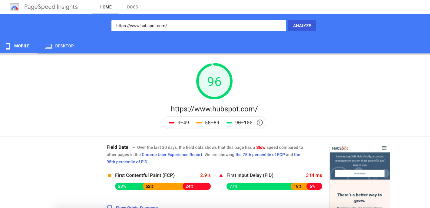
How do you know what your site speed is? There are a variety of free online tools you can use, but our favorite is Google's PageSpeed Insights. To show you how this tool works, let’s use HubSpot's website as an example.
How to Use Google's PageSpeed Insights Test
- To get started, simply type in the website page URL you want to test.
- Once you select "Start Test," it could take a few minutes to actually run the test.
- Once the test is complete, you will receive your results. Looks like HubSpot.com is loading in 2.9 seconds. Not bad, HubSpot!
Screenshot from Google Page Speed Insights
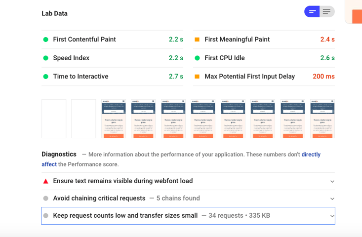
What we love about Google's free page speed tool is that it allows you to see your site performance on mobile and desktop. It also gives you a list of suggestions for optimizing your site to improve your page speed.
Screenshot from Google Page Speed Insights
Now, it's your turn to test your site speed. If it takes more than three seconds for your website pages to load, it’s time to make some improvements. Don't let a slow site speed cost you potential leads and customers.
2. Too Much Text
Having too much text on your website can be overwhelming. Your users likely won’t want to take the time to read paragraph after paragraph. Plus, an overabundance of text can also make your website look cluttered and difficult to navigate.
This homepage screenshot is the perfect example of too much text (AND an outdated layout).

Screenshot from Best Electronics
Here's a fact about human nature. If our brain recognizes a task as too difficult or requiring too much energy to solve, our instinct is to move on to the next solution. Our brain would rather take the path of least resistance. So, bottom line — make sure the copy on your website is concise, to the point, and speaks to your buyer persona.
3. No Whitespace
Some people see whitespace as wasted space, but that just isn't true, especially for web pages.
Whitespace gives your website visitors' eyes a little break. It can also help break up thoughts in an intentional way, which helps users better understand your messaging and digest your content.
Here's an example of bad web design by a company that is not using whitespace optimally.
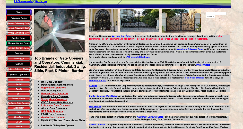 Screenshot from L.A. Ornamental
As you can see, without whitespace, your eyes don't know where to look. It makes it very difficult to follow along, right? And that makes for a poor user experience.
We recommend breaking up your content into smaller chunks, as well as using images and icons, to convey your specific message.
4. No Clear User Journey
The last thing you want your website visitors to think after they visit a page on your site is "Now what?"...
Having an unclear next step is not only confusing to the end user, but it can also cause them to become frustrated, lose interest, and bounce right off your site and continue the search for an answer to their question or problem. This causes a lot of missed opportunities.
When building out your site, think about the purpose of each page. Is the purpose to educate visitors about a service you offer? What information is the user looking for? What would be the next step in their journey? Perhaps it's to contact your company to schedule a consultation.
The key here is to be intentional and guide your website visitors to become leads while continuing to nurture them with valuable content and information.
5. Not Mobile-Friendly
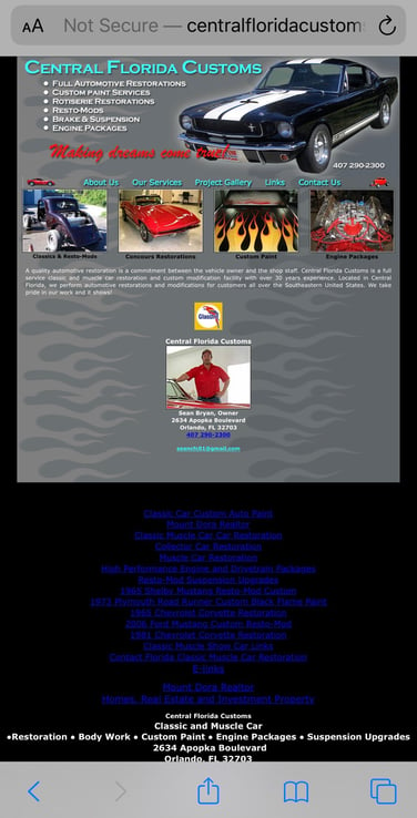
As of October 2024, over 61% of traffic on the web is generated through mobile devices. But sadly, not all websites are mobile-friendly.
When a website doesn't have a mobile responsive design, the formatting doesn't change from the desktop version when a user visits the site on their smartphone. In turn, the text is too small to read, the images are falling off the page, and the navigation is probably not always visible. Not a good user experience, right?
Our example is from a classic car restoration business in Florida. When viewed on mobile, the webpage doesn’t adjust to fit the screen size, requiring users to zoom in to read the content or navigate to another page.
Analytics and Lead Generation Signs of a Bad Website Design
Google Analytics and other online measurement tools are key in determining whether or not you have a bad website. There are several metrics to pay attention to when diagnosing the issues of your website, including:
- Poor lead generation
- High bounce rate
- Low monthly website visitors
- Poor ranking for organic keywords
The sections below discuss each of these metrics in more detail and provide more information about how to analyze your website data.
6. Poor Lead Generation
Are you getting few to no leads each month through your website? This could be a sign there are some things you could refresh or redesign on your site.
Perhaps you don't have a clear user journey as we discussed above. Or, maybe you have too much text, so your website visitors don't take the time to read your content and understand how your company can help them.
If you're a HubSpot user, it’s super simple to see how many new contacts you've received over time. HubSpot also compares your results to the previous month, which really helps you see how well you're doing. Here's an example of what that field looks like.

In HubSpot, you can also see what sources your leads come from. Here's an example from one of our own contacts, where the lead source is from "Organic Search", as you can see in the bottom box. It also shows the visitor's activities after they landed on our site.

If you aren't on HubSpot, don't worry. You can use Google Analytics instead. All you have to do is set up your goals. And if you're not too comfortable with Google Analytics, there are plenty of resources online where you can find step-by-step directions on how to set up your goals.
On top of Google Analytics, you should also be paying close attention to your CRM (customer relationship management) platform. If you don't currently have a way to specify new leads that converted via the web, try to add that qualifier so you can track website leads versus other leads gained through cold calls, direct mail, social media, and other avenues.
7. High Bounce Rate
A bounce is when a website visitor comes to a page on your website and immediately exits without interacting any further with your site. Your website's average bounce rate is attributed to the number of bounces in a given period. To see your bounce rate, you can use HubSpot or Google Analytics.
When you log in to Google Analytics, on the home screen, you'll see your number of users, sessions, and the average bounce rate across your site.

So, how do you know if your bounce rate is too high? It really all depends on your business and the industry average. In general, most websites should aim for a bounce rate of 26% to 70%. B2B business websites, however, have an average bounce rate of 25% to 55%.
8. Low Monthly Website Visitors
There are a number of ways you can get this information, but we'll look at HubSpot and Google Analytics.
Let's start with HubSpot. In the Marketing Dashboard, along with the "New Contacts" figure we mentioned above, you'll find your number of website sessions.

Then, in Google Analytics, you'll want to look at the "Users" figure. As a general rule of thumb for both HubSpot and Google Analytics, if you see your monthly website visitors trending down consistently, especially by a high percentage, that could be a sign you have a bad website that needs to be refreshed or redesigned.
At the same time, if they are consistently low or stagnant, this may also be an indication. For instance, there could be an opportunity to add content to target organic keywords, which we'll talk about more below.
9. Poor Ranking for Organic Keywords
As we mentioned above, low website visitors could be a sign that you aren't ranking well for organic keywords.
One free tool you can use to see how you are ranking for keywords is Ubersuggest. Simply type in your website domain and click "Search". Once your results load, you'll see the number of organic keywords you're ranking for, as well as the organic monthly website traffic — paid keywords if you're doing any paid advertising on Google.
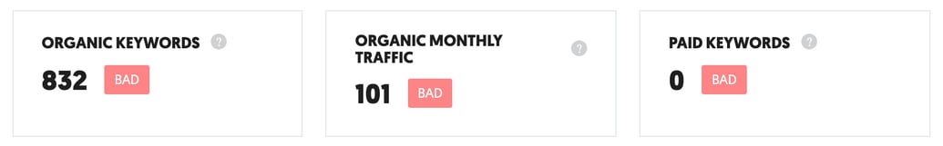
Screenshot from Ubersuggest
From there, click on "Organic Keywords" to view all of the organic keywords you are currently ranking for in Google. Some important factors to pay attention to are:
- Volume: Monthly search volume
- Position: Where your site is listed in Google search results for that search term
- Estimated Monthly Visits: The number of website visitors that come to your website via that search term
"SEO Difficulty" is another factor to keep in mind for your site’s content strategy. The SEO difficulty rating represents how difficult it may be to rank for that search term. The higher the number between 1 and 100, the more difficult it is to rank for that keyword.
So, if a relevant search term has a high monthly search volume and a low SEO difficulty rating, it’s likely a great keyword to incorporate on your site.
When Is It Time for a Website Redesign?
How many of those signs did you identify as issues with your site?
Less than half? Maybe you need to think about refreshing your site with some minor adjustments. More than half? It may be time for a complete website redesign.
Book a 20-minute website audit to discuss your website needs and how we can help your company grow.