
Client Overview
In 2021, a team of experienced brokers based in Newport Beach, California set their sights on becoming an independent firm of financial advisors, but first needed a fresh brand identity that represented the team and their renewed client offerings. The group had a strong sense of who they were, plus a firm confidence in the many factors contributing to their mission and values, but lacked the strategic vision and direction that an external branding partner could provide to help them launch a new practice.
Setting Sail Towards a New Brand
After establishing that a new business name and logo was necessary, our clients participated in a background questionnaire that helped our Creative team at LAIRE begin to develop a story and positioning that then informed all other visual aspects of the brand. This is a process of self-discovery that helps to pinpoint the influences or sources of inspiration that a business may draw from. Upon completion of this survey, we learned several things from our client that gave us a clearer idea about how the new brand personality, tone, and characteristics would function and come together.
For more about the in-depth branding process at LAIRE, check out our blog:
"Breaking Down a Creative Digital Agency’s Branding Process"
Inspiration
Envision a lifeguard watching over beachgoers perched atop lifeguard Tower 68 along the Pacific ocean’s lively shore of Newport Beach, and that’s where you’d find our client’s founder. The principles of care and watchfulness that our client brings to his financial service clients in his present-day office overlooking the same ocean are the same skills that he honed during his early years on the lifeguard stand.
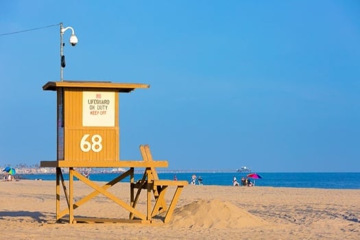
The sights, smells, and sounds that he observed in his hometown are the very elements that gave life towards a new brand. While the ocean is a continuously moving environment, the lifeguard tower holds steady; providing security and stability in comparison to the ever-changing swells, winds, and currents.
The imagery of the ocean from the lifeguard tower, combined with a sentimental watercolor painting of a wave from our client’s mother, gave our team the pieces they needed to get to work on this new brand.
Our Strategies and Results
To ensure overall brand unity and cohesiveness, as well as provide previous clients with the assurance they needed to accompany our clients in their new business venture, the LAIRE creative team supplied the following solutions and services.
Naming & Logo Process: Honing in on the Look
We started by noting imagery that our client connected with, and also that would be recognizable to their future customers. Images that had symbolism towards themes of “protection”, “watchful”, “steadfastness”: binoculars, a lifeguard, a guard tower, and waves were part of our careful consideration as well.
Our team then began the process of digital brainstorming – gathering whatever ideas they had and related imagery to explore shapes, structure, dark and light, complementary typefaces, color and color palettes.
Here’s one of our early artboards, exploring these ideas to whittle down to groupings of related styles to share with the client and get their feedback.
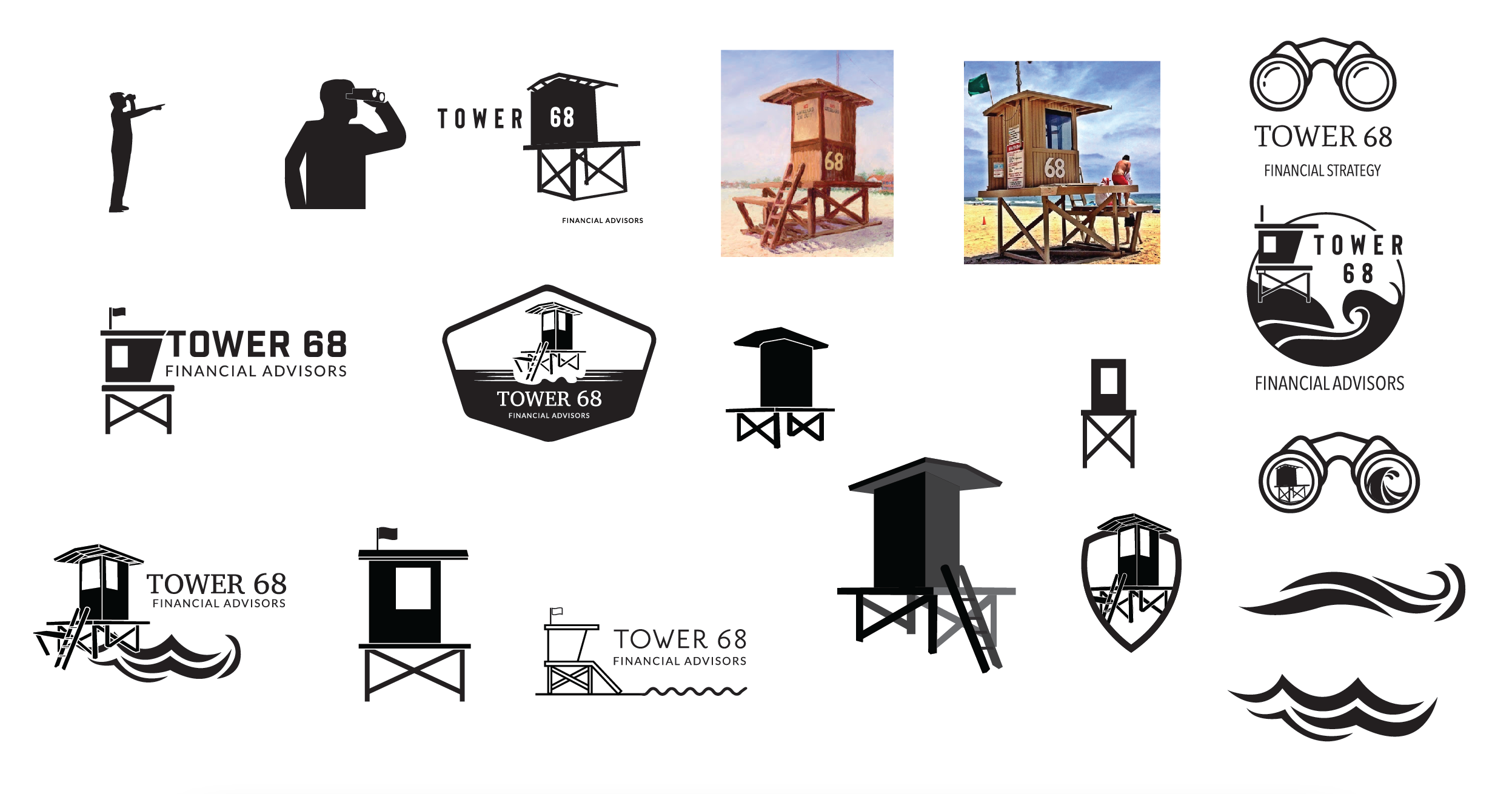
From that brainstorming process, and getting feedback from the client, we kept returning to the imagery of the lifeguard tower. In our naming process, we had identified that the name could mean different things to different people – if we were to proceed with the name “Tower 68” for the firm, the best choice would be to reinforce the name with imagery, so the viewer had no question what we were referring to when they saw “Tower 68 Financial Advisors”.
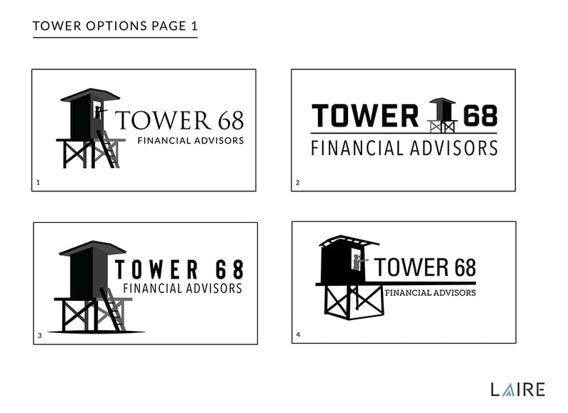
We then focused our design attention on the shape of the tower, the relationship between the typeface and the illustration, and the weight and balance of all the components. This is one page of many in our round 2 of logo concepts:
As we were narrowing down on the shapes and structure of the logo, we also introduced conversations about colors. We knew that the palette should be inspired by the ocean and the beach, and the client liked combinations of blues and light browns. We presented these color palette options, that included cool blues, green blues, warm tones to get the client’s feedback: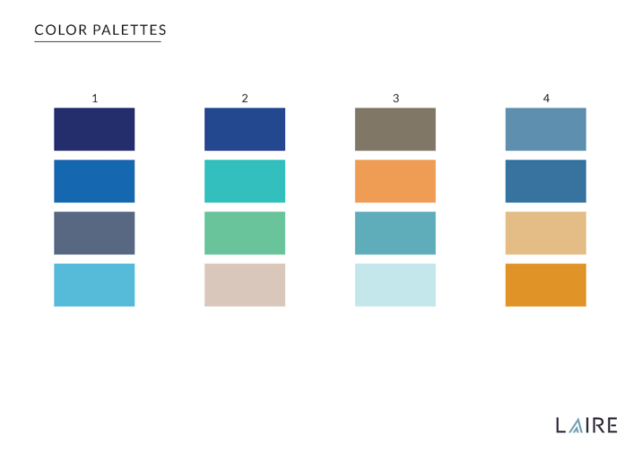
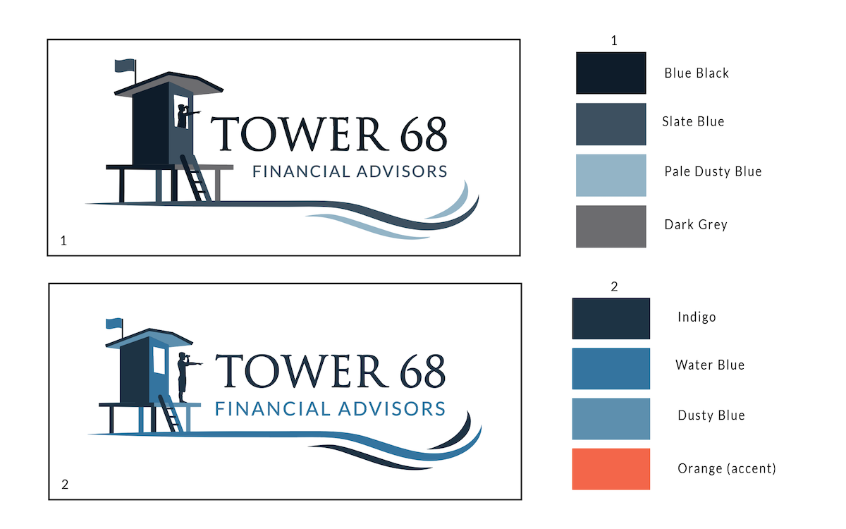
We were getting close – the client had a favorite lifeguard tower shape, and we worked on typeface combinations. Our next-to-final round of logo concepts would marry shape, typeface, and color.
The Final Product: A New Brand Experience
From that presentation, we collaborated with the client on the final logo, using an all-blue color palette, serif, and sans serif typefaces, and removing the human lifeguard imagery.
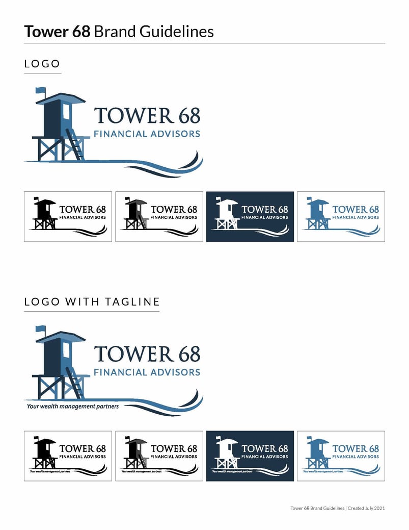
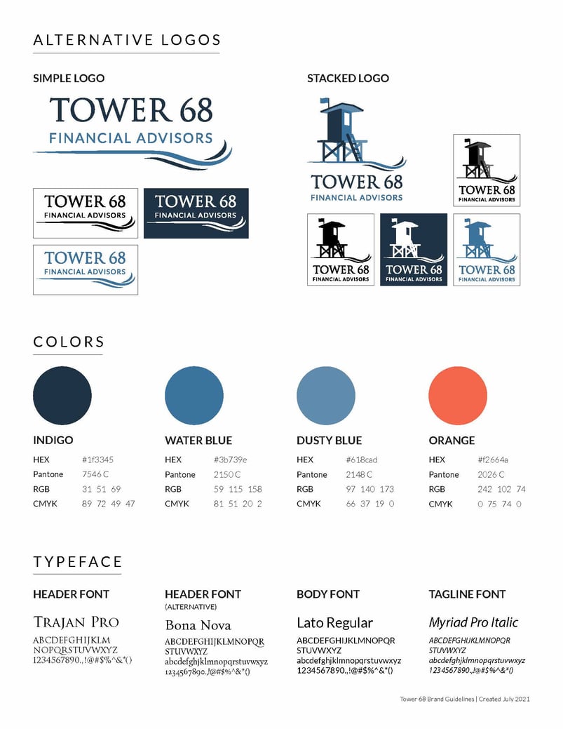
With every brand development project, we prepare brand guidelines, so the client has a single source of truth for all future branding assets, and they can share these guidelines with vendor partners for the production of related collateral.
We also created standards for 1 color logo version, and usage for the logo on darker backgrounds, or in constrained spaces.
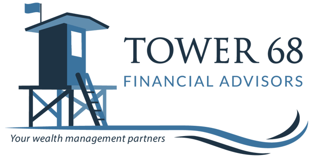
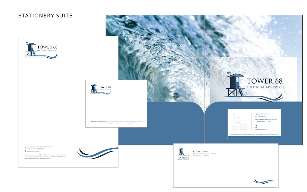
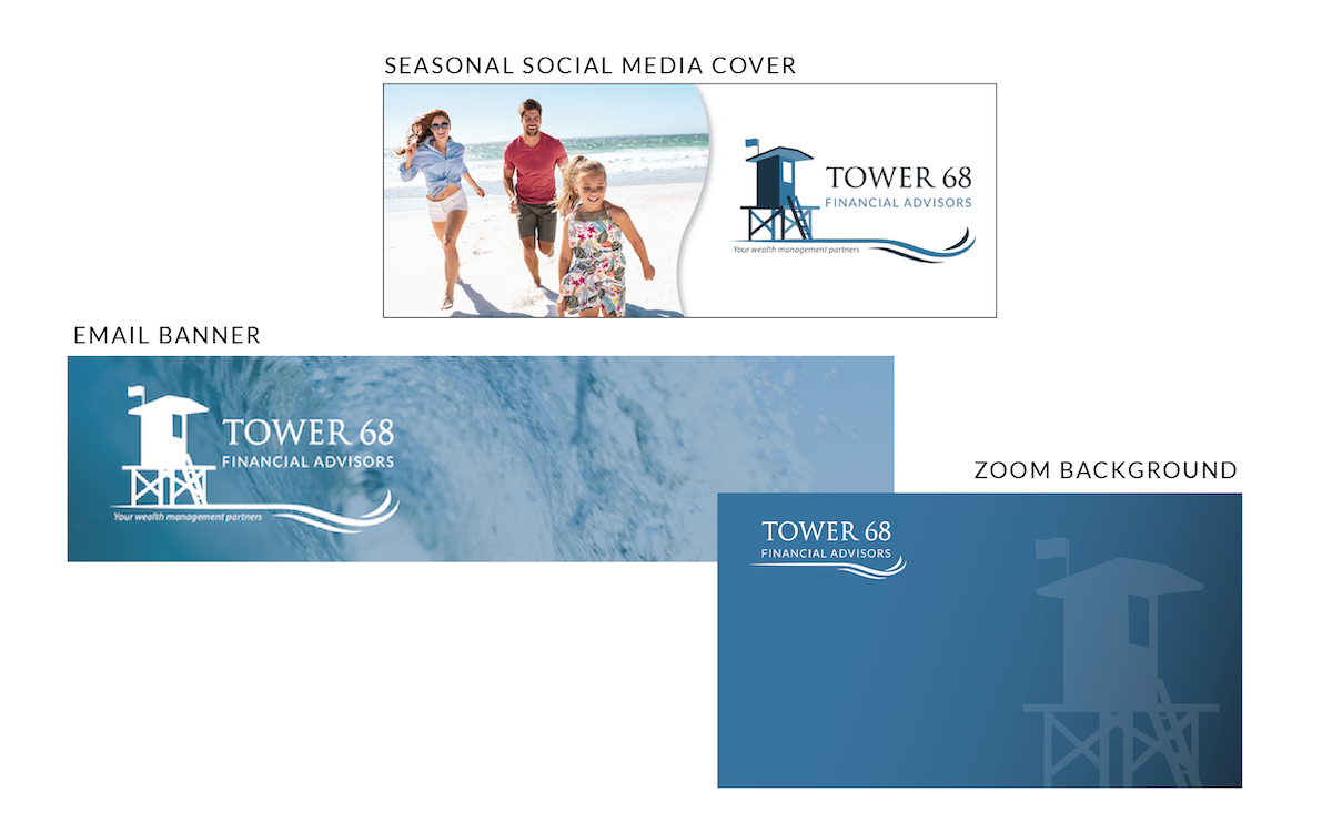
To tie a bow on the final presentation, we prepared physical and digital assets to accompany the company’s new brand experience. A stationary suite, social media covers, email banners, and Zoom backgrounds are just a few examples of what we can deliver to ensure the client has everything they need for a successful launch.
Results
We are proud of the outcome of this brand development process, and the client is thrilled that their company branding is what they imagined it could be. Seeing a new brand come to life is one of our favorite things to do here at LAIRE, although we know for many business owners this process can seem incredibly overwhelming.
Back in 2020, we took the time to adjust our business from Laire Group Marketing to LAIRE and launched a fresh brand identity that encompassed who we had become. (You can read about our full experience, here.) We’ve done this process ourselves and are well-equipped to support you as you do the same.
Our creative team is laser-focused on capturing the details that will ensure your ideas are transformed into a beautiful visual experience that customers and prospects will resonate with. Have you considered if it’s time for a rebrand? Let’s discuss your options and the steps it will take to make your branding something that you’re truly proud of.
Ready to jumpstart your own branding project?